If your website feels like it has too many problems at once, the safest move is usually not to fix everything. It is to decide what comes first. That is the part people skip when they are tired, busy, or worried that the site has drifted too far from where it should be. I do not think that is a character flaw. I think it is a planning problem.
When an artist or charity starts asking what to repair first, the real questions are usually smaller and more practical: Is the site still safe? Can people still contact us? Are the pages loading properly? Which pages are quietly hurting trust? And what can wait until next week without creating new damage?
The basic principle is simple. Fix the things that protect ownership, recovery, and access before you spend time polishing the parts that merely look old. That approach lines up with the plain guidance in Google’s SEO Starter Guide and the W3C WCAG quick reference: clarity, structure, and usable pages matter more than cleverness. I will keep the order strict here so the work stays manageable.
By the end of this guide, you will have a practical priority list for the first pass, a one-page checklist you can reuse, and a clear point where DIY stops being efficient and support starts being the wiser move. If you want a broader overview of the site’s service shape, the Features of Taeko Website Design page is the easiest place to compare options.
Quick context: why “everything needs fixing” is usually not true
Most sites do not become unusable all at once. They drift. A homepage headline goes stale, then a form starts failing quietly, then an image slows the page, then the site begins to feel unreliable even though no single issue looks dramatic on its own. That is why people feel overwhelmed: they are looking at a bundle of small failures, not one giant problem.
The right response is not panic. It is triage. Safety comes first, because it protects the recovery path. Reliability comes second, because it determines whether visitors can actually use the site. Performance comes next, because slow pages and oversized images frustrate people quickly. Visibility, usability, and accessibility follow because they shape whether the website still communicates clearly and earns trust.
If you want a model for the kind of support the site is built to offer, start with the Support page. If you want to see the current publishing area, the Blog index and Latest News page are the right places to watch for related updates.
Simple terms before we start
I want the checklist to stay plain, so here are the few terms that matter most.
- Backup – a saved copy of the site or database that gives you a recovery path if something breaks.
- Update – a newer version of WordPress, a theme, or a plugin that may include fixes or changes.
- Access check – a review of who can log in, who owns the accounts, and whether the right people can still reach them.
- Broken link – a link that leads to the wrong page or nowhere useful.
- CTA – a call to action, such as Contact, Donate, Book, or Enquire.
- Metadata – the title and description that help a page make sense in search results and previews.
- Alt text – the written description of an image, which supports accessibility and helps explain what the image shows.
- Contrast – the difference between text and background, which determines whether text is easy to read.
That is enough vocabulary to work carefully without turning this into a technical seminar. The point is not to impress anyone. The point is to keep the next decision obvious.
Step 1 – Safety basics: backups, updates, and access checks
Safety is the first line because it protects the site from avoidable damage. If the site is about to be changed, updated, or repaired, I want to know three things before anything else: can it be restored, is it current, and can the right people still get in?
1) Confirm a recent backup exists
WordPress’ own backup documentation is a useful reminder that backups are not symbolic. They are what allow rollback when a plugin update, content edit, or layout change goes wrong. If you do not know where the latest backup lives, treat that as a priority issue, not a housekeeping note.
Check the following:
- When the last backup ran.
- Whether it includes both files and database.
- Whether it is stored somewhere separate from the live site.
- Whether you know how to restore it without guesswork.
Artist example: if a portfolio update goes wrong, you should be able to roll back without losing the previous gallery arrangement.
Charity example: if a donation page or campaign banner breaks after editing, recovery needs to be immediate enough that supporters do not land on a dead end.
2) Apply updates before you redesign anything
If WordPress core, the theme, or a plugin is due for an update, that usually comes before cosmetic work. The reason is practical: older code increases the chance of conflict, and conflict is what turns a small adjustment into a larger repair. WordPress’ updating guidance is straightforward on this point. Keep the site current before you start rearranging the furniture.
- Update the system in a controlled order.
- Test the homepage, contact page, and one or two important internal links after each change.
- Watch for forms, menus, or image blocks that shift unexpectedly.
- Write down what changed so you are not guessing later.
Practical rule: if the update touches the software layer, do it before the content layer. Fixing a header line while the underlying plugin is unpatched is the digital version of polishing a door while the lock is jammed.
3) Verify access and ownership
This is the part people forget until a password expires or the person who “usually handles it” is on holiday. Check who has admin access, who owns hosting and domain logins, and whether more than one trusted person can reach the essentials. Access is not glamorous. It is the gate.
- Confirm the login details are current and stored securely.
- Make sure the primary email address for account recovery still works.
- Check that at least one backup contact can reach hosting or domain support.
- Remove stale access for people who no longer need it.
If the answer to any of those checks is “I am not sure,” that belongs at the top of the list. Responsibility is not optional here. Unclear ownership is how routine maintenance becomes an incident.
Step 2 – Reliability: broken links, forms, and page errors
Once the site is safe to touch, I move to reliability. Reliability is simply this: can a visitor complete the basic job they came to do? For an artist, that might mean sending an enquiry or viewing a portfolio. For a charity, it might mean donating, volunteering, or reading a campaign page without friction.
1) Scan for broken links first
Broken links are small failures with outsized annoyance. They make the site feel neglected even when the rest of it is still healthy. Start with the pages people use most: home, support, contact, news, blog, and the pages that carry the main CTA. Click what matters. Do not assume a menu item works just because it looks polite.
Useful places to check include the home page home page, the Contact page, and any article that points people toward a next step. If a link has moved, fix the destination rather than leaving the visitor to discover the problem for you.
- Check top navigation.
- Check footer links.
- Check buttons inside content blocks.
- Check image links if the site uses them.
- Check any link added in the last few months.
Artist example: a “View the portfolio” button that lands on an empty page wastes trust.
Charity example: a “Donate now” button that sends people to the wrong form is not a minor issue. It is a failed transaction path.
2) Test forms from a visitor’s point of view
A form can look fine and still fail quietly. That is why form testing belongs near the top of the reliability checklist. Submit the form, confirm the response arrives where it should, and make sure the auto-reply does not sound like it was written by a machine that has forgotten its purpose. If the site has several forms, test the one tied to the highest-value action first.
- Contact form.
- Enquiry or commission form.
- Donation or support form.
- Newsletter signup.
- Volunteer or booking form.
Look for these failure modes:
- The form submits but no email arrives.
- The confirmation message appears but the message content is unclear.
- A required field blocks submission without explaining why.
- The mobile version hides part of the form or the submit button.
3) Check page errors and odd layout shifts
Some problems are not outright broken. They are merely awkward enough to weaken confidence. A heading may wrap badly, a button may drift under a graphic, or a section may leave a strange blank gap on mobile. These are not cosmetic distractions. They are signs that the page structure needs attention before the site looks more fragile than it is.
Keep a note of where the problem appears and what changed recently. If the issue follows a specific update, the fix is often simpler than it looks. If the issue is repeated across pages, that usually points to the theme or a reusable block that needs careful review. Not glamorous. Very fixable.
Step 3 – Performance: slow pages and heavy images
Once the site is reliable, the next question is speed. Slow pages make visitors work harder than they should. That matters for everyone, but especially for artists showing visual work and charities trying to support people who may already be in a hurry. A page that loads lazily can feel like the site is asking for patience instead of offering service.
The plain-language reference I use most often is web.dev’s Learn Performance guide. It keeps the focus on the basics: load time, page weight, and the practical changes that reduce friction. You do not need to memorize every metric. You do need to know which page feels heavy first.
1) Reduce the heaviest images first
Large images are usually the first thing to trim. That does not mean removing good visuals. It means using the right size for the job instead of serving a file that is ten times larger than the layout needs. On artist sites, the temptation is obvious: beautiful images. On charity sites, the temptation is often emotional imagery. Both are valid. Both still need sensible file sizes.
- Resize images before upload where possible.
- Compress large files that do not need full resolution on the page.
- Replace decorative images that do not add value.
- Check gallery pages, hero banners, and background sections first.
Artist example: a portfolio page with many large photos may need the featured images reduced before anything else.
Charity example: a campaign page with several heavy images may need one strong image and one caption instead of three large files.
2) Look for slow pages before chasing the whole site
Do not try to diagnose the entire site in one pass. Test the homepage, one image-heavy page, one contact path, and one article. If one page feels much slower than the others, that gives you the first target. A single sluggish page often tells you more than a vague site-wide feeling ever will.
- Open the page on desktop and mobile.
- Watch whether the hero image appears late.
- Check whether embedded video, maps, or sliders are the cause.
- See whether the page gets lighter once unnecessary elements are removed.
3) Use the smallest fix that solves the delay
Sometimes the right move is to resize images. Sometimes it is to remove a plugin that loads assets on every page. Sometimes it is to simplify the homepage so it does not try to prove everything at once. The smallest effective fix is usually the right one. The site does not need a performance ceremony. It needs less drag.
If you are wondering where recurring admin work could be simplified, a neutral planning resource such as AI consulting services can help a team decide whether automation belongs in the workflow at all. That is not a substitute for careful maintenance. It is one way to decide where manual effort stops paying for itself.
Step 4 – Visibility: homepage clarity, title/meta basics, and local relevance
Visibility comes after the site is safe, reliable, and reasonably fast. At this point I care about whether the message is obvious. Can a visitor understand what the site is for in a few seconds? Can search engines read the page cleanly? Does the homepage still match the organisation’s current work?
1) Review the homepage first
The homepage is the front door. If it is vague, outdated, or overloaded, the rest of the site starts from a weaker position. The page should say who the site is for, what it offers, and what the visitor should do next. Nothing mystical. Just plain orientation.
- Does the headline still match the current purpose?
- Is the main image still accurate?
- Is the primary button obvious?
- Are there any stale dates or old campaign references?
Artist example: if the practice has shifted from general illustration to commissions, the homepage should say so clearly.
Charity example: if the current priority is volunteer recruitment, the homepage should not still behave as if the last fundraising drive is the main event.
2) Tighten title and meta basics
Page titles and descriptions do not need to be poetic. They need to be accurate. Google’s search guidance rewards pages that are clear, helpful, and specific. That means using titles that match the page purpose and descriptions that tell the reader what they will actually find. If a page is called “Home,” it should still have a useful title behind the scenes.
- Check the homepage title.
- Check the title on the support page.
- Check any page that receives most of the search traffic.
- Check whether the meta description still reflects the page honestly.
For related reading, the site’s Latest News and Blog areas are the best places to keep current updates visible without burying them in the wrong part of the site.
3) Keep local or audience relevance clear
“Local relevance” does not always mean a physical address. For artists and charities, it often means the right audience, the right region, or the right kind of work. If the site serves a particular community, say that plainly. If the organisation serves a wider U.S. audience, keep the copy grounded in that reality without pretending to be everywhere at once.
This is where many sites drift into generic language. They start with a clear purpose and end up sounding like they were assembled from spare parts. Keep the language exact enough that a visitor can tell whether they belong there.
Step 5 – Usability: mobile readability, navigation, and contact/action buttons
Usability is where the site stops being theoretically sound and becomes actually usable. If the visitor cannot read it on a phone, cannot navigate it without hunting, or cannot find the action button, then the site is asking them to do extra work for no reason. That is not a small issue. It is the site losing the room.
1) Check mobile readability first
Open the site on a phone and scan for the obvious failures: tiny text, cramped spacing, a menu that swallows the screen, or buttons that are too close together. This is the fastest way to spot whether the design still respects the way people actually browse. Desktop views are useful, but mobile is where weak structure shows up fastest.
- Can you read the text without zooming?
- Are the buttons easy to tap?
- Does the page scroll naturally?
- Do images and headings stay in order?
Artist example: image captions should remain readable and close enough to the image they describe.
Charity example: donation or volunteer buttons should stay obvious on mobile, not drift below unnecessary content.
2) Simplify navigation
Navigation should help people make one clean decision after another. That means keeping menu labels short, using familiar words, and removing links that no longer matter. If every page is trying to become the homepage, the menu is too crowded.
- Limit the main menu to the essentials.
- Make sure the support path is easy to find.
- Keep the contact path visible.
- Remove duplicate or near-duplicate links.
If you are trying to decide how much of this should be managed in-house, compare the options against the support guidance on Features of Taeko Website Design. The point is to match the site structure to the actual workload, not to pretend the workload will disappear because the menu looks neat.
3) Make contact and action buttons obvious
A website can be beautifully written and still fail if nobody can figure out how to take the next step. Contact, donate, book, enquire, subscribe, and support buttons should all be visible, descriptive, and easy to reach. The button text should say what happens next. A visitor should not have to decode a riddle to get in touch.
- Use one primary action per page when possible.
- Keep the wording active and specific.
- Place the action near the top of the page and again near the end if needed.
- Test the button on mobile, not only on desktop.
If a visitor is ready to contact you and the site makes them hunt, the site is in the way. That is the failure mode to remove first.
Step 6 – Trust & accessibility: alt text, contrast, and readable fonts
Trust and accessibility sit together because both are about whether the site is still fair to use. A visitor should be able to understand the pages without strain, guesswork, or hidden visual tricks. This is not a special bonus. It is the minimum standard for a public website.
1) Write alt text that describes the image
Alt text does not need to be clever. It needs to explain the image in a way that helps someone understand the page. If the image is decorative and adds nothing, it may not need alt text beyond what the theme handles. If the image carries meaning, say what it shows in plain language. The W3C quick reference is the right kind of standard to keep in view here because it treats accessibility as structure, not decoration.
- Describe the image content, not the mood alone.
- Keep the wording short and useful.
- Avoid repeating the surrounding heading word for word.
- Make sure gallery and portfolio images are not left blank if they matter to the page.
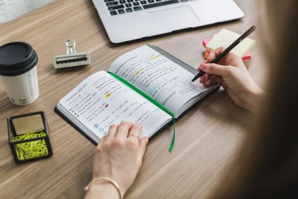
The featured image in this article is a good model because it shows a checklist workspace rather than a generic abstract graphic. That is the standard to keep aiming for: useful, visible, and plain enough to help.
2) Check contrast and font readability
If text is light grey on white, or a button relies on a delicate color choice to be visible, that belongs on the fix list. Readability is not a luxury for large sites. It is a baseline expectation. A visitor who has to squint is already losing patience.
- Read body text on a phone in daylight if possible.
- Check headings, buttons, and captions separately.
- Look for small text that cannot comfortably carry important meaning.
- Make sure the font choice still looks steady, not decorative in the wrong place.
3) Confirm trust signals still line up
Trust signals are small but cumulative: current contact details, clear ownership, a working privacy policy, and pages that do not look abandoned. If the site says one thing and the structure suggests another, visitors notice the tension even if they cannot name it. Keep the site aligned with the work it claims to do.
For readers who want a broader overview of the site’s public content rhythm, the Latest News page and the Blog archive are the right places to keep that rhythm visible.
One-page priority checklist
Use this table as the first pass. If you can only fix a few things this week, start at the top and move down in order. I am keeping the effort column honest because a good priority list respects time as well as risk.
| Issue | Impact | Effort | Priority |
|---|---|---|---|
| No recent backup or unclear recovery path | High – you may not be able to restore the site safely | Low to medium | 1 |
| WordPress, theme, or plugin updates overdue | High – risk of conflict, security issues, or broken features | Low | 1 |
| Admin access uncertain or locked to one person | High – ownership and recovery become fragile | Low to medium | 1 |
| Contact, donation, or enquiry form failing | High – visitors cannot reach you or complete an action | Low to medium | 1 |
| Broken links on homepage, support, or contact paths | Medium to high – trust and usability drop quickly | Low | 2 |
| One or more pages loading slowly | Medium – users may leave before the page finishes | Medium | 2 |
| Large images or heavy galleries | Medium – slows the page and weakens mobile use | Medium | 2 |
| Homepage message no longer matches current work | Medium – visitors may not understand the site quickly | Low to medium | 3 |
| Title and meta descriptions are vague or stale | Medium – search visibility and clarity suffer | Low | 3 |
| Navigation labels are crowded or confusing | Medium – people get lost more easily | Medium | 3 |
| Mobile text is cramped or buttons are too small | Medium – the site is hard to use on the most common device | Medium | 4 |
| Alt text, contrast, or font readability is weak | Medium – accessibility and trust drop | Low to medium | 4 |
If you want a short version of the rule: fix anything that could block access, block contact, or block recovery before you spend time refining the page copy. The order matters. It keeps the work honest.
When to pause DIY and ask for help
There is a sensible point where a site is no longer a tidy self-service job. That point is usually obvious if you listen for it. If the same problem keeps returning, if an update changes the layout in several places, or if a form or payment path becomes unstable, the site needs more than a quick pass.
These are the red flags I treat seriously:
- You do not know whether the latest backup exists or can be restored.
- Logins, hosting, or domain ownership are unclear.
- A contact or donation path has failed more than once.
- A layout change affects several pages at once.
- The site feels slower after an update and you cannot isolate the cause.
- You are spending more time guessing than fixing.
That last one matters. Guessing is expensive. Good support reduces guesswork.
If the site is turning into a repeating maintenance puzzle, use the Contact page and ask for help before the next change becomes another failure mode. If the question is whether a workflow should be automated, a neutral planning resource can help map where automation might safely belong. The point is to choose deliberately, not to add tools because the inbox is noisy.
For some sites, that support conversation belongs right next to the public pages that explain the work. If you need a reminder of how the site’s support offer is framed, return to the Support page and the Features of Taeko Website Design page before you make another round of changes.
A practical closing checklist
If I had to compress this entire article into one working order, it would be this: verify backup, updates, and access; test the core forms and links; reduce the slowest page weight; tighten the homepage and metadata; make the site readable on mobile; then clean up alt text, contrast, and navigation. That sequence is simple because it is built around the failure modes that hurt most.
- Protect the recovery path first.
- Fix the visitor journey second.
- Improve speed third.
- Clarify the message fourth.
- Make the site easier to use on phones fifth.
- Raise the accessibility baseline sixth.
That is not a glamorous list, but it is a reliable one. A website that is safe, current, and easy to use does not need to look busy to be useful. It just needs the right problems handled in the right order.
If you are ready to review the next step, start at the Blog index, check the current notes on Latest News, and then use Contact if the site needs a cleaner hand than DIY can give it. Order first. Then polish.